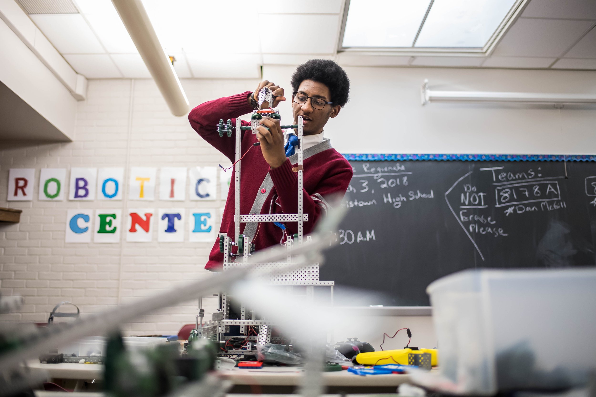
HERE’S WHY YOUR HIGHER EDUCATION WEBSITE NEEDS HIGH-QUALITY PHOTOS
IS YOUR HIGHER EDUCATION WEBSITE USING PHOTOS EFFECTIVELY? PROSPECTIVE STUDENTS HAVE AN EXPECTATION FOR SCHOOL WEBSITE PHOTOS; HERE’S WHAT YOU NEED TO KNOW.
There are more than 4,000 colleges and universities in the U.S., though that number is constantly in flux.
Prospective students have seemingly unlimited choices when it comes to which schools they’re going to apply to.
One of the ways you can make your higher education website stand out is by incorporating high-quality photos.
Let’s take a look at all the reasons why.
THEY HELP PAINT A PICTURE OF YOUR INSTITUTION
Each year, students and their parents are shopping around for colleges and universities. Early on in their search, they likely don’t know much about your institution. While written descriptions are useful and necessary, providing high-quality photos will help them get a sense of what it’s really like to be there.
IMAGES WILL KEEP PROSPECTIVE STUDENTS ON YOUR SITE LONGER
The truth is that humans are visual creatures. Studies have shown that we actually process visual images 60,000 times faster than we do text. That means that the photography you include on your site is already making an impression on your visitors before they’ve even consciously read the first word.
When you offer professional photos on your site, prospective students can get a better sense of what your school is like. They’ll be more likely to take the time exploring your site to learn more.
HIGH-QUALITY PHOTOS WILL IMPROVE THE USER EXPERIENCE
Have you ever visited a website that’s just a non-stop wall of text? It’s not very inviting when that happens, and chances are people bounce off it more often than not.
Having beautiful, professional photos of your campus will improve the user experience greatly. This is true for current students, faculty, staff, and alumni as much as it is for prospective students.
Your website is the hub of your school’s digital community. A high-quality website is something for everyone involved to be proud of.
THE ALTERNATIVES: STOCK PHOTOS AND AMATEUR SHOTS
Sure, there are other ways to add images to your higher education website. You could compile amateur shots taken by administrators, staff, faculty, and students. You could also reach into the giant library of stock images available online.
Both of these alternatives are not nearly as effective as hiring a professional photographer, though.
For one, amateur shots will lack the cohesion of a professional photographer’s images. This means that it can make your school’s image seem scattered and chaotic.
On top of this, it can simply look unprofessional. That’s probably the last thing students and their parents want to see when they’re deciding where they should invest in their child’s education.
The other option, stock photos, is even worse than using amateur photographs.
With amateur photos, you’re at least giving site visitors a portrait of your school. Even if it isn’t a polished one. When you use stock photos, you’re not contributing to the browser’s visual understanding of the school at all.
Stock photos read as inauthentic and spammy. They often aren’t classy, intellectually stimulating, or emotionally moving. When you insert stock photos onto your site’s pages instead of actual photographs of your institution, you’re probably doing more harm than good for your school’s image.
THEY PROVIDE A CONSISTENT AESTHETIC TO SUPPORT YOUR SCHOOL’S BRAND
Schools and businesses are not the same. However, the rules of digital marketing apply to institutions of higher education just as much as they do to online start-ups.
Having a brand image is an important part of reaching your target audience. Hiring a professional photographer can help you achieve this end.
HIGH-QUALITY PHOTOS IMPLY PROFESSIONALISM, AUTHORITY, AND COMPETENCE
We’ve all visited websites that don’t exactly look professional. The design is clunky, the site loads slowly, and the aesthetic is all over the place. On top of all that, the photos look like they were taken from a moving train in 1947.
When you create a website for your higher education institution, it’s important to understand the psychology of how people relate to websites. People don’t just use the information on the website to judge the worth of your institution, but also the nature of the website itself.
If your site doesn’t have high-quality photos, it can make your institution come off as unprofessional and illegitimate. No matter how big your endowment fund, a low-quality website with low-quality photos will lead visitors to think your school is subpar.
Institutions always want to attract the highest-caliber candidates. This is why it’s essential to understand how important this aspect of your site and branding is.
When you visit a website, you likely get an instant aesthetic read on the brand without even realizing it. You might determine that a company looks like a small-town, tiny business, or that they look like a well-funded and powerful company.
Your site’s visitors will make the same type of split-second determination about your institution. High-quality photos are one of the best ways to ensure that they understand how competent and professional your school really is.
YOUR HIGHER EDUCATION WEBSITE WILL BENEFIT FROM HIGH-QUALITY PHOTOS
Is it time for you to revamp your higher education website? It’s now the standard for institutions to have sleek, aesthetically beautiful, and highly-functional sites. This is for current students, prospective students, alumni, and faculty to utilize.
One of the most important elements of any website is the photographs. You’ll therefore want to ensure that they are professional, high-quality, and representative of your school’s image.
Are you interested in hiring a professional photographer for higher education or corporate photography? Contact me today!


